Support
Sign In
Menu
Support
Sign In
Websites
Add Ons – Websites
Ministry One
Logo Design
Color Consultation
Website Strategy
Themes
More Products
Streaming
Giving
Clover People
ChMS Coaching
Pricing
Resources
Blog
Ebooks
Try Free
Support
Sign In
Menu
Websites
Add Ons – Websites
Ministry One
Logo Design
Color Consultation
Website Strategy
Themes
More Products
Streaming
Giving
Clover People
ChMS Coaching
Pricing
Resources
Blog
Ebooks
Try Free
Support
Sign In
Websites
11 Must Haves for Every Church Website
Websites
Features
Themes
Add-Ons
MinistryOne
Clover Media
Logo Design
Color Consultation
Website Strategy
More Products
Streaming
Features
Giving
Features
Clover people
Features
Add-Ons
Church Management Coaching
Pricing
Blog
Clover
Blog
7 Things Every Church Website “About Us” Page Should Have
20 Amazing Church Website Templates and Themes
How to Create an Internal Request Form
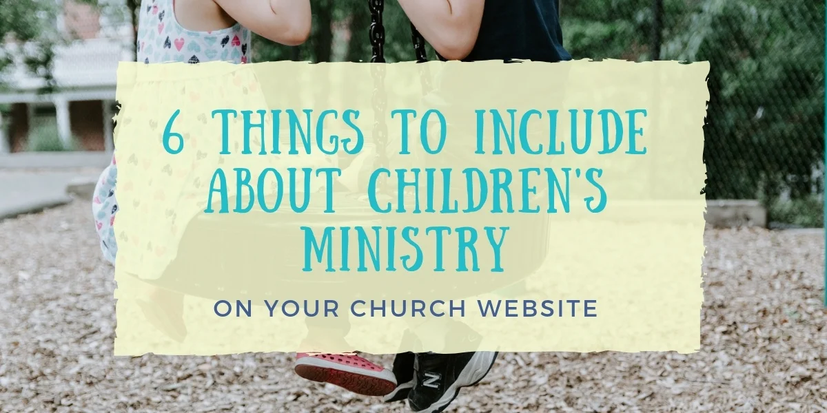
Six Things to Include About Children’s Ministry on Your Church Website
What to Consider When Featuring Your Church Staff on Your Church Website
Team Killers: Four Things That Will Divide & Destroy Your Team
The Dos and Don’ts of Church Announcements
Four Things to Include When Your Sermon is About Money
8 Tips to Create a Great VBS Registration Form
How to Build an Online Prayer Community
8 Fun Summer Church Activities
Newly Launched Websites
9 Ways to Build Thriving Church Small Groups
Preparing for Holy Week
5 Most Asked Questions On Tithing and Donations
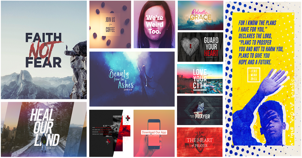
Three Powerful Ways to Use Church Media in Your Ministry
7 Pages Your Church Website Should Have
Planning and Promoting a Church Fall Festival
Religious Easter Traditions to Help You Celebrate
A Big Thank You: Ten Creative Ways to Show Appreciation to Your Donors
10 Fun Church Harvest Festival Activities for All Ages
15 Ways Churches Can Bless Moms On Mother’s Day
4 Christmas Sermon Ideas You May Not Have Thought About
How to Acknowledge Dads on Father’s Day at Your Church
The Ultimate Guide to Pastor Appreciation Day
Web + App + Media + Live Stream
Web + App + Media + People
Web + App + Media